
티스토리 뷰
UI_UX/HTML & CSS
[CSS] 7. css3(border / background / transform / animation / multi_ui)
쟌쥰 2020. 1. 25. 22:54border
<!DOCTYPE html>
<html>
<head>
<meta charset="UTF-8">
<title>Insert title here</title>

<style type="text/css">
* {
	pdding: 0px;
	margin: 0px;
}
body {
	font: 30px "Arial Black";
	color: #333;
	margin: 20px;
}

li {
	list-style: none;
	width: 100px;
	height: 70px;
	text-align: center;
	float: left;
	padding-top: 30px;

	border-radius: 10px 30px 50px 70px;
	-webkit-border-radius: 50px 50px 50px 50px;
	-moz-border-radius:50px 50px 50px 50px;
	-ms-border-radius:50px 50px 50px 50px;
	-o-border-radius:50px 50px 50px 50px;
	/*
		webkit : 구글, 사파리
		moz : 파이어폭스
		ms : 익스플로러
		o : 오페라
	 */

	box-shadow: inset 20px 30px 20px 1px rgba(18, 51, 86, 0.8);
}


.c1 {
	background-color: red;
}

.c2 {
	background-color: green;
}

.c3 {
	background-color: blue;
}

.c4 {
	background-color: yellow;
}
</style>
</head>
<body>

	<ul>
		<li class="c1">J</li>
		<li class="c2">A</li>
		<li class="c3">V</li>
		<li class="c4">A</li>
	</ul>
</body>
</html>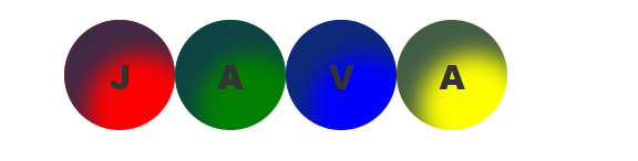
background
<!DOCTYPE html>
<html>
<head>
<meta charset="UTF-8">
<title>Insert title here</title>
<style type="text/css">
div,p{
width: 200px;
height: 200px;
border: 1px solid red;
}
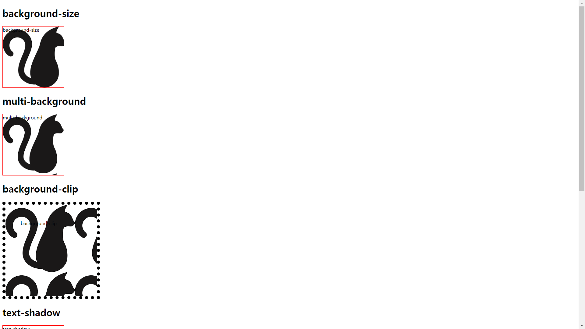
#bgsize{
background: url("resources/image/cat1.png");
background-size: cover;
}
#multibg{
background-image: url("resources/image/cat1.png"), url("resources/image/littledeep_cat_style1.png");
background-size: contain;
}
#bgclip{
border: 10px dotted black;
padding: 50px;
background-color: skyblue;
background-clip: padding-box;
background-image: url("resources/image/cat1.png"), url("resources/image/littledeep_cat_style1.png");
}
#textshadow{
text-shadow: 1px 2px #ccc;
}
#wrap{
word-wrap: break-word;
}
@font-face{
font-family: "Goyang";
src: url("resources/Goyang.ttf") format("truetype");
}
#goyang{
font-family: "Goyang";
font-size: 30px;
}
</style>
</head>
<body>
<h1>background-size</h1>
<div id ="bgsize">background-size</div>
<h1>multi-background</h1>
<div id="multibg">multi-background</div>
<h1>background-clip</h1>
<div id="bgclip">background-clip</div>
<h1>text-shadow</h1>
<div id="textshadow">text-shadow</div>
<h1>word-wrap</h1>
<div id="wrap">dkanrjskrhdqorTmwlakfrhakrTjqhtpdyduddjfhaksTjwnauswhgrpTdjdy</div>
<h1>font-face</h1>
<div id="goyang">고양시 고양체 이쁘다 귀엽다</div>
</body>
</html>
transform
<!DOCTYPE html>
<html>
<head>
<meta charset="UTF-8">
<title>Insert title here</title>
<style type="text/css">
div{
width: 200px;
height: 200px;
background: red;
color: white;
font-size: 30pt;
word-wrap: break-word;
}
#tlate{
transform: translate(50px, 50px);
}
#trotate{
transform: rotate(30deg);
}
#tscale{
transform: scale(0.5, 0.5);
}
#tskew{
transform: skew(10deg, 30deg);
}
#tran{
transition: width 0.5s, background 1.5s linear, transform 1.5s;
}
#tran:hover{
width: 800px;
background: blue;
transform: translate(300px, 0px);
}
li{
width: 500px;
background: gray;
margin-bottom : 3px;
font-size: 30pt;
font-weight: bold;
list-style-type: none;
transition: width 1s linear, color 1s linear, letter-spacing 1s;
cursor: pointer;
}
li:hover{
width: 800px;
color: red;
letter-spacing: 5px;
}
</style>
</head>
<body>
<h1>translate</h1>
<div id="tlate">translate(x,y) : 위치 이동</div>
<h1>rotate</h1>
<div id="trotate">rotate(deg) : 회전</div>
<h1>scale</h1>
<div id="tscale">scale(x,y) : 크기</div>
<h1>skew</h1>
<div id="tskew">skew(deg,deg) : 변형</div>
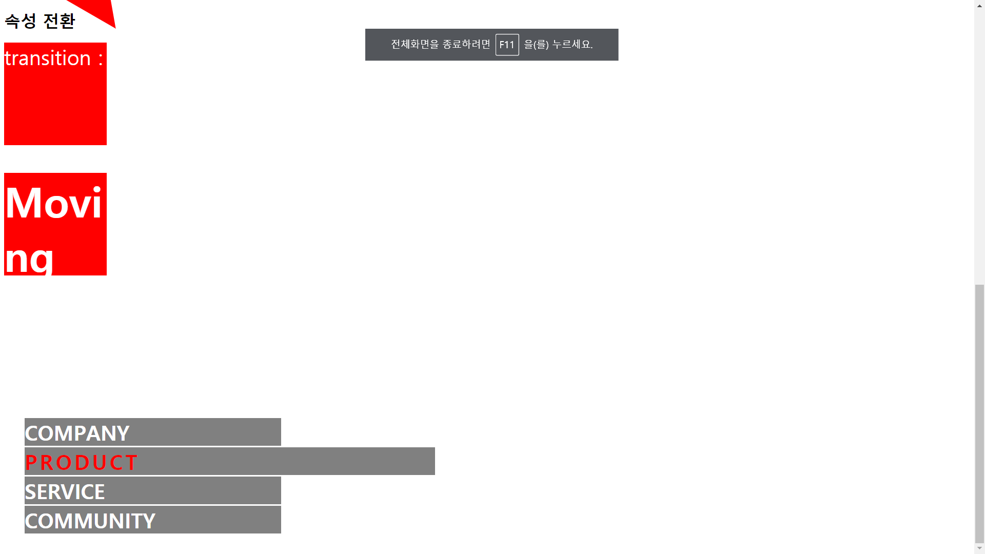
<h1>속성 전환</h1>
<div id="tran">transition : </div>
<div>
<h1>Moving Menu</h1>
<ul>
<li>COMPANY</li>
<li>PRODUCT</li>
<li>SERVICE</li>
<li>COMMUNITY</li>
</ul>
</div>
</body>
</html>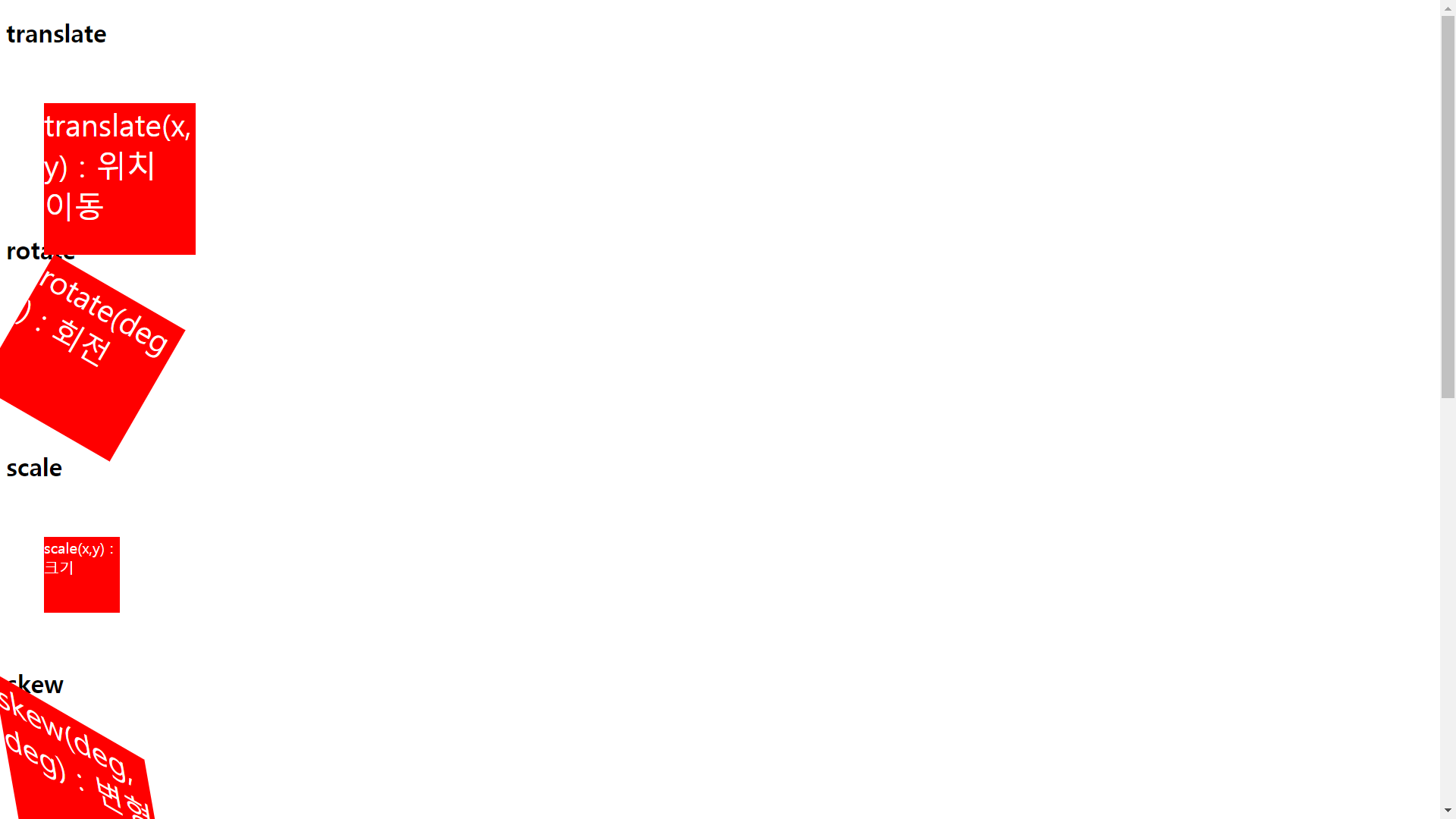
animation
<!DOCTYPE html>
<html>
<head>
<meta charset="UTF-8">
<title>Insert title here</title>
<style type="text/css">

	div{
		width:100px;
		height:100px;
		font-size:30pt;
		background-color:red;
		word-wrap:break-word;
		animation:mybox 1s infinite;
	}

	@keyframes mybox{
		0%{width:150px;height:150px;background:yellow;transform:translate(10px,10px);}
		25%{width:200px;height:200px;background:blue;transform:translate(50px,50px);}
		50%{width:250px;height:250px;background:orange;transform:translate(100px,100px);}
		75%{width:800px;height:800px;background:pink;transform:translate(50px,50px);}
		100%{width:200px;height:200px;background:red;transform:translate(10px,10px);}

	}

</style>


</head>
<body>
	<h1>Animation</h1>
	<div>Animation</div>
</body>
</html>
multi_ui
<!DOCTYPE html>
<html>
<head>
<meta charset="UTF-8">
<title>Insert title here</title>

<style type="text/css">
	p{
		column-count: 3;
		column-gap: 20px;
		column-rule: 2px dotted red;
	}
</style>
</head>
<body>


		<p>
			"우리는 별이오." "별?" "무수히 많고 그래서 어쩌면 보잘것없어 보일 수도 있지. 바라보지 않는 이상 우리는
			서로를 잊을 수도 있소. 영원의 숲에서처럼 우리들은 서로를, 자신을 돌보지 않는 한 언제라도 그 빛을 잊어버리고 존재를
			상실할 수도 있는 별들이지." 숲은 거대한 암흑으로 변했고 그 위의 밤하늘은 온통 빛무리들 뿐이었다. 칼의 말은 이어졌다.

			"그러나 우리는 서로를 바라볼 줄 아오. 밤하늘은 어둡고, 주위는 차가운 암흑 뿐이지만, 별은 바라보는 자에겐 반드시 빛을
			주지요. 우리는 어쩌면 서로를 바라보는 눈동자 속에 존재하는 별빛 같은 존재들이지. 하지만 우리의 빛은 약하지 않소. 서로를
			바라볼 때 우리는 우리의 모든 빛을 뿜어내지." "나 같은 싸구려 도둑도요?" 네리아의 목소리는 슬프지 않았다. 그리고 칼의
			대답도 평온했다. "이제는 아시겠지? 네리아 양. 당신들 주위에 우리가 있고, 우리는 당신을 바라본다오. 그리고 당신은
			우리들에게 당신의 빛을 뿜어내고 있소. 우리는 서로에게 잊혀질 수 없는 존재들이오. 최소한 우리가 서로를 바라보는 이상은."

			어둠 속에서 네리아의 눈이 별처럼 아름답게 반짝였다. 나는 혹시 반짝인 것은 그녀의 눈물이 아닐까 따위의 생각은 관두기로
			했다. 그래서 고개를 돌려 밤하늘을 바라보았다. 내가 바라보자, 별들은 나에게 빛을 주었다. - 본문 중-
		</p>

</body>
</html>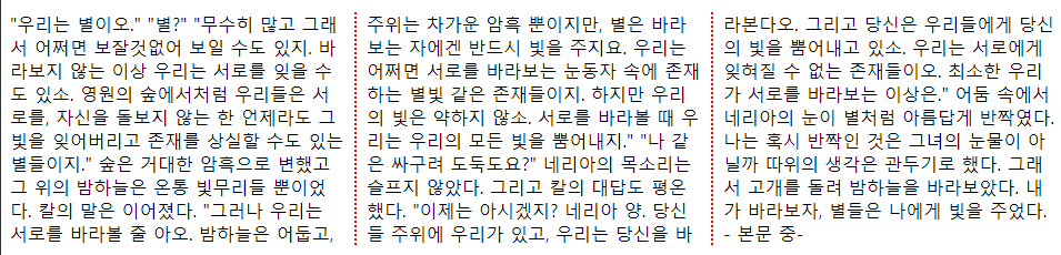
'UI_UX > HTML & CSS' 카테고리의 다른 글
| [CSS] 6. 레이아웃 ( float / clear / display / overflow / position ) (0) | 2020.01.25 |
|---|---|
| [CSS] 4. 단락 (0) | 2020.01.25 |
| [CSS] 3. Font (0) | 2020.01.25 |
| [CSS] 1. 외부/내부 스타일시트(CSS) 적용방법 (0) | 2020.01.25 |
| [HTML] 3. HTML5 시맨틱 태그 (0) | 2020.01.25 |
공지사항
최근에 올라온 글
최근에 달린 댓글
- Total
- Today
- Yesterday
링크
TAG
- Oracle
- MVC
- Update
- java 환경설정
- .
- java
- JDBC 프로그램 작성단계
- 상속
- controller
- 객체
- model
- 추상화
- 캡슐화
- select
- JdbcTemplate
- view
- jdbc
- Delete
- OOP
- INSERT
- 객체지향
- ojdbc6.jar
- 다형성
- Scott/Tiger
| 일 | 월 | 화 | 수 | 목 | 금 | 토 |
|---|---|---|---|---|---|---|
| 1 | ||||||
| 2 | 3 | 4 | 5 | 6 | 7 | 8 |
| 9 | 10 | 11 | 12 | 13 | 14 | 15 |
| 16 | 17 | 18 | 19 | 20 | 21 | 22 |
| 23 | 24 | 25 | 26 | 27 | 28 |
글 보관함